Introduction
The need for ocean literacy is globally recognized and is critical for supporting cultures of conservation, restoration, and sustainable use of our natural resources (Santoro et al., 2017). In an ocean-literate society, individuals develop data literacy skills—learners can make sense of specific values, consider trends, and compare one set of ocean data to another. Authentic data sets, like those generated by ocean observatories and other research activities, provide supportive context for a learner to derive meaning from the data, and they have been found to improve data literacy and engagement (Kjelvik and Schultheis, 2019).
Museums, science centers, and aquariums serve to spark learners’ interest in science and the ocean. Increasingly, exhibits in these informal learning environments (ILEs) present quantitative information in visual displays (Ma et al., 2019). However, these representations are inaccessible to visitors who are blind or low-vision (BLV) and to those who are unable to make sense of the information due to low math literacy or limited educational background. Such barriers often cause these individuals to avoid ILEs altogether (Tokar, 2004; Landau et al., 2005).
ILEs are increasingly recognizing the importance of employing multiple modalities to engage all learners and are leveraging sound to enhance visitor experience. While sonic additions of music, soundscapes, and field recordings (e.g., Pijanowski and Ghadiri, 2018) add qualitative value, there is a need to explore the potential of sound to facilitate engagement with quantitative information. Data sonification is a promising avenue for increasing accessibility to data within the museum context (Sawe et al., 2020). Sonification offers an alternative approach to visual representations by converting data into non-verbal sounds, making it accessible to individuals with visual impairments or those who more easily process auditory information (Walker and Mauney, 2010).
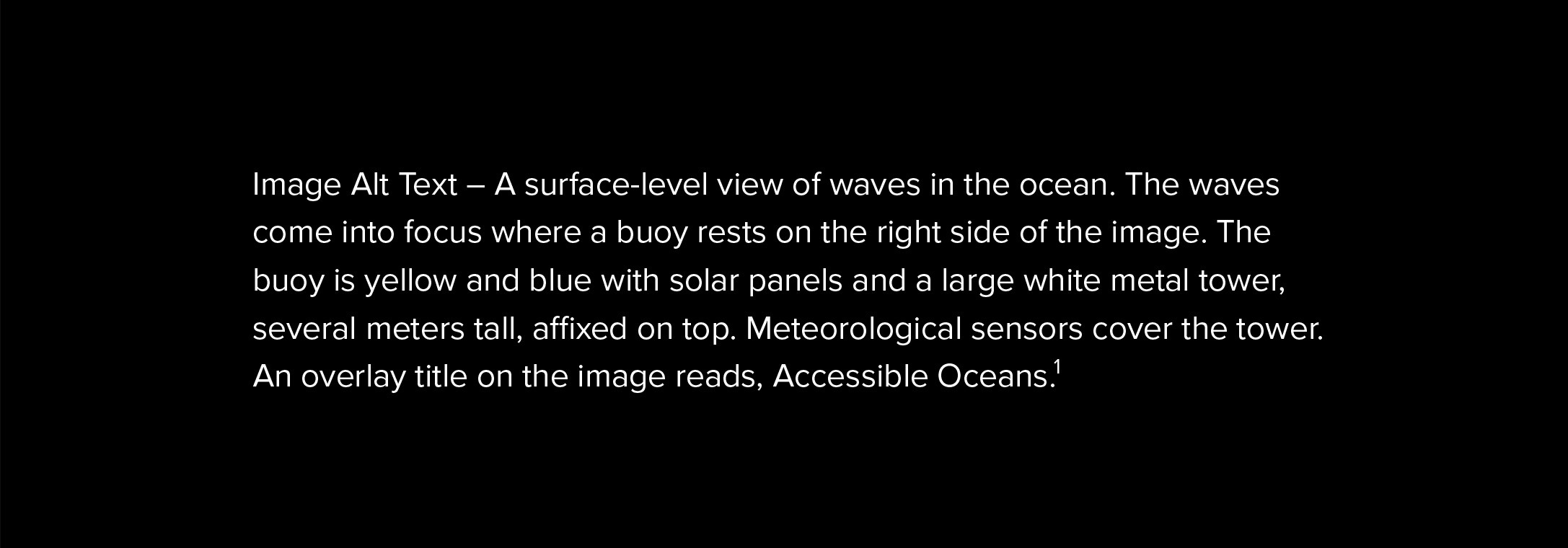
Here, we describe newly developed auditory displays of ocean data for ILEs that include data sonifications and supporting contextual information as well as the design process to create them. The aim of the “Accessible Oceans” project is to inclusively design auditory displays of authentic ocean data to study their ability to convey meaningful aspects of ocean science to both sighted and non-sighted learners. We are sharing findings from this work to help inform the design of future accessible museum exhibits featuring sonification of ocean data, and we describe our project with a particular focus on the inclusive human-centered design approach to enable others to build their own accessible educational tools.
What is Data Sonification?
Data sonification is for our ears what data visualization is for our eyes. Defined as “the mapping from data to one or more parameters of an audio signal or sound synthesis model for the purpose of better understanding, communicating or reasoning about the original model, experiment, or system” (Scaletti, 2018), data sonification has generated a spectrum of research, applied tools, and artistic works (see Box 1). Additionally, it has the potential to provide a “curb-cut effect” for data visualization, that is, just as curb-cuts at crosswalks benefit more than just the wheelchair users they were designed for, sonification can make complex data more accessible to more than just the BLV community. For BLV learners and researchers, sonification provides access to quantitative information; for sighted learners, sonification provides another sensory opportunity for engaging, exploring, and communicating.
Box 1. Sonification Resources
International Community for Auditory Display (ICAD; http://www.icad.org), a forum for sharing information and research on auditory displays of all types, including data sonification.
Sonification World Chat (https://sonificationworldchat.org/), an online group that specifically addresses data sonification in STEM disciplines. Their periodic meetings provide updates on a variety of current data sonification projects.
Decibels Data Sonification Community (https://decibels.community/), an online group for sharing tips and sonifications. Check out more of their sonification resources here: https://github.com/Decibels-Sonification/sonification-resources.
Highcharts Sonification Studio (https://sonification.highcharts.com), a free online web-based tool based on research at the Georgia Institute of Technology Sonification Lab that allows non-specialists to create their own simple data sonifications.
Kyma (https://kyma.symbolicsound.com/). All data sonifications created for our project utilized the Kyma hardware & software environment made by Symbolic Sound.
Mathworks is developing a simple data sonification function for Matlab with guidance from its Accessibility Customer Advisory Board. A rudimentary and easy-to-use Matlab sonification toolbox created in 2003 by Josh Miele, SKDTools, is available at https://github.com/JoshMiele/SKDTools.
|
Data sonification’s goals are similar to those of visual graphs: sonification can be used to communicate complex systems and as a means for discovery and understanding. A sonification, like a visualization, requires choices about how data are presented or transformed. For example, sonifications can be built from a direct mapping of data into the acoustic domain, where each data point is expressed in sound (Kramer, 1994; Worrall, 2019), or data can be used to control the parameters of a sound synthesis model. While designing a visual graph entails decisions of scale, axes, symbols, and plot type, considerations for sonification include the mapping of frequency, amplitude, timbre, and duration.
Data sonification is gaining traction in the sciences as an acknowledged method (Hermann et al., 2011) with evaluated effectiveness in communicating complex, multidimensional, and time varying data (Flowers and Hauer, 1995; Neuhoff, 2011). In the space sciences, for example, the United Nations Office for Outer Space Affairs published a report advocating for sonification within research and outreach (UNOOSA, 2023). Though data sonification has been embraced by the astronomy community for both research and public outreach (e.g., Cooke et al., 2017; Harrison et al., 2021), it remains underutilized (Sawe et al., 2020).
Using Authentic Data
For this project, we used data from the US National Science Foundation Ocean Observatories Initiative (NSF OOI; Smith et al., 2018; see also Oceanography special issue 31(1) at https://tos.org/oceanography/issue/volume-31-issue-01). While the scale and complexity of the NSF OOI data make them challenging to directly feed into an educational setting (Greengove et al., 2020), the “OOI Nuggets” (https://datalab.marine.rutgers.edu/ooi-nuggets/) provide a ready-to-use resource of processed, quality-controlled, and packaged data sets (hereafter referred to as curated data sets). We selected a handful of these curated data sets that each exemplify an important ocean phenomenon—air-sea carbon dioxide (CO2) exchange, ocean response to tropical cyclones, underwater volcanic eruptions, and dynamics of animals in the marine ecosystem. Additionally, these data sets include varying types of data—single time series, layered time series, and multi-dimensional vertical profiles. The intention was both to create displays to convey meaning of these important processes and to develop techniques for sonifying various data types to support informal learning.
For each curated data set, we created a list of tiered learning objectives representing the key science takeaways (see Box 2 for more information). These learning objectives provide a roadmap for decisions made in how to sonify the data and a means to evaluate whether learners came away with an increase in knowledge surrounding a specific topic. The learning objectives for each curated data set are tiered in that they increase in complexity, allowing engagement opportunities for learners with a broad spectrum of background knowledge, as is typical in ILEs. These learning objectives map to a taxonomy of data interpretation actions presented by Friel et al. (2001) of translation (restating what a graph or chart says), interpretation (combining multiple pieces of data to draw conclusions), and extrapolation (going beyond the presented data to make predictions or inferences).
Box 2. Auditory Display Prototypes
Net Flux of CO2 Between Ocean and Atmosphere
(https://doi.org/10.5281/zenodo.8162769)
These data soundtracks describe the net transfer of carbon dioxide (CO2) across the air-sea interface at two US National Science Foundation Ocean Observatories Initiative Array locations, the Pioneer Array while it was off the coast of New England and the Global Argentine Basin Array. This auditory display provides the opportunity for audiences to learn about a biogeochemical process that is related to the role of the ocean in modulating atmospheric CO2. Release of CO2 to the atmosphere is associated with an exhaling sound, analogous to the ocean breathing. The relationship between CO2 exchange and sea surface temperature is also explored.
2015 Axial Seamount Eruption
(https://doi.org/10.5281/zenodo.8173836)
These data soundtracks explore two ocean phenomena that can be measured using a seafloor bottom pressure recorder from the NSF OOI Regional Cabled Array—changes in the height of the water column due to the daily tidal cycle and changes in the height of the seafloor due to the 2015 eruption of the Axial Seamount Volcano (Wilcock et al., 2018). The display separates the tidal signal and volcanic eruption into separate sounds so that learners can understand each individually and then hear how they overlap with the tides continuing their pattern across the time of the eruption. One of the challenges here was to determine how best to represent increasing pressure (increasing numbers are often represented with higher frequencies) which accompanied seafloor drop (naturally associated with a drop in frequency).
Long-Term Axial Seamount Inflation Record
(https://doi.org/10.5281/zenodo.8173859)
These data soundtracks leverage data from NOAA PMEL that extend the record of the NSF OOI data back to 1997. This auditory display focuses on the long-term pattern observed by bottom pressure recorders where the seafloor inflates (lifts) until it reaches an empirically derived threshold (plus or minus), then an eruption event occurs, and the seafloor drops. The auditory display focuses on the idea that seafloor inflation is related to the filling of the magma chamber beneath the volcano, giving the audience the analogy of an expanding balloon. By noting the seafloor height change, eruption events, and a ping for when the inflation threshold is reached, learners understand the relationship between seafloor inflation and underwater volcanic activity.
Ocean Response to Extratropical Storm Hermine
(https://doi.org/10.5281/zenodo.8173880)
These data soundtracks from the NSF OOI Pioneer Array use multiple time series data sets to explore how energy is transferred between the ocean and atmosphere during a heavy storm. The display guides learners through different elements of the storm (rain, wind, wave height, and water temperature) individually and then layered on top of each other. In this way, learners can hear how processes are connected, e.g., as the wind increases so does the surface wave height. Key elements of this display were the scaffolding of the learning objectives to guide learners through the processes and their relationships to each other and determining sounds unique enough to be identified separately, but that still sound good together.
Zooplankton Daily Vertical Migration Gets Eclipsed!
(https://doi.org/10.5281/zenodo.8173914)
These data soundtracks explore the diel vertical migration of zooplankton off the coast of Oregon using data from the NSF OOI Endurance Array. The tracks explore how the daily pattern of zooplankton migration is intricately linked to solar radiation, and how that relationship can go awry during a total solar eclipse when day becomes night for a few minutes. The key to this display was the streamlining of complex bio-acoustic sonar data into something that could be played clearly in an audio track. In lieu of focusing on sonifying every data point in the vertical profile of the data, we pulled the depth of maximum sonar return of the zooplankton out of the data set. This is similar to how you would view the graph, i.e., you would not read the graph from left to right scanning each profile, your eyes would pick up the thin yellow line that denotes the zooplankton against the darker background of null data and follow along the line as it changed in depth through time.
|
For example, in the air-sea CO2 exchange nugget, at a basic level we want learners to understand that CO2 from the atmosphere goes into and out of the ocean. This objective is suitable for even young visitors and those who have no background knowledge in ocean science, and it is achieved by translating the rises and falls in the sonification to the outgassing and absorption processes. More advanced learners should be able to recognize seasonal differences by interpreting patterns in the sonification throughout the year and understand that this exchange changes throughout the year because colder water holds more CO2 than warmer water. The third objective challenges learners to extrapolate and predict the ocean temperature at a different location based on the exchange pattern, for example, discerning that a location with net absorption all year round must be in a colder part of the globe. This tiered structure permits learners at multiple levels of data and ocean science literacy to come away learning something new about the ocean.
Inclusive Design Process
One of the important features of the “Accessible Oceans” project is its inclusive human-centered design process. This begins with our interdisciplinary team of project principal investigators who represent each field needed to design effective auditory displays of oceanographic data for ILEs (sound design, oceanography, and learning sciences) and importantly, a scientist who is BLV. This diversity of expertise and experience is mirrored and expanded in our multidisciplinary advisory board, which includes oceanographers, sound experts, museum educators, teachers of BLV students, and BLV advocates, some of whom are BLV themselves. These two groups provide the foundation needed to ensure a quality product is created that meets the needs of our target audience.
Additionally, our human-centered design approach comprised multiple steps of building and evaluating auditory displays and their components with input from various stakeholder groups, including the BLV community. These steps are described in more detail below.
Oceanography Expert Interviews. We conducted multiple sessions with oceanographers to establish a solid foundation in the science surrounding these oceanographic data sets. These semi-structured video call sessions each lasted 60–90 minutes and included a high-level framework and goals, while allowing for free-flowing dialog. Our aim was to ensure that the meaning of the data was accurately conveyed, and scientific rigor was maintained. The first interview was a group session with participants drawn from an assortment of ocean scientists who brought various backgrounds and expertise to the discussion. The goal of the session was to understand how scientists would start to consider these data sets within the audio space. While the session gave high-level insights for potential design directions, it was clear that we needed to engage individually with scientists who could offer specific expertise in each data set. For the next round, five PhD scientists with specialized knowledge were invited to meet individually with the two oceanographers on the project team. These scientists were asked to discuss how they would describe the data set associated with their expertise to a school audience, analogies they might use to describe the phenomena in the data, and what sounds they imagined would go with the different data sets. This included suggestions of additional NSF OOI or other data sets that might be helpful to explain the ocean phenomena more fully. The experts selected were known to be skilled at explaining their research to non-science audiences. These sessions were critical to the development of the core lessons, data sonification, and context-setting narration.
BLV Teacher Interviews. A session with two teachers at a partner school for the blind was conducted to elicit information on how they use sound in their classrooms, introduce scientific content to their students, and engage their students with data. The semi-structured interview offered several ideas for helpful tactics in how to use sound to explain the principles of graphs and the properties of data. Several key best practices also emerged, for example, inclusion of a clear notification at the start and stop of the sonifications so that the learner knows when to start fully listening and then knows when the sonification is over (https://doi.org/10.5281/zenodo.8176581).
Primary Sonic Foundation Survey. Sensemaking of data via sonification begins with the selection of sound parameters to use to map the data. After taking initial feedback from the expert sessions, the project sound designer created a suite of sonic foundations—prospective sound mappings to represent each variable in the curated data sets. To explore the viability of these sound mapping choices with a broad audience, we developed a screen reader accessible Qualtrics survey (https://accessibleoceans.whoi.edu/creating-accessible-media-on-a-qualtrics-survey/) that was distributed across oceanographic, educational, and BLV listservs. Respondents were given brief descriptions and a list of the core lesson ideas for three curated data sets along with three to seven potential sounds that could represent it. For example, the air-sea CO2 exchange data set focuses on two processes: CO2 going into the ocean (absorption) and being released from the ocean into the atmosphere (outgassing). Respondents listened to each potential sound and provided opinions on how well they felt the sounds embodied, or conveyed, the meaning of the data parameter they were meant to represent.
Initial Prototype Feedback Interviews. Taking feedback from the scientific expert and teacher sessions and survey results, we constructed data sonification prototypes. These were reviewed by two additional teachers of BLV students and two BLV adults during semi-structured interviews. Both groups were asked for their reactions to the sonification prototypes and suggestions for improvement. Additionally, teachers were asked how they support science and data learning activities with their students and for specific feedback on how the prototypes can be improved for use with BLV students. These sessions provided insights that shaped future iterations of the design. For example, users found there was too much overlapping of information with earcon markers and sonification playing in the Long-term Axial Seamount Inflation Record. This led us to move spoken year axis markers to the start and end of the sonification.
BLV Student Feedback Sessions. We then engaged middle and high school BLV students to evaluate the effectiveness of updated sonification prototypes. As in the sessions with the BLV adults, students were asked about their background knowledge surrounding the topic of each curated data set and their use of assistive technologies before listening to the sonifications. After listening to the sonification, they were asked for their reactions and suggestions for improvement as well as asked questions to determine whether they had understood the concepts presented in the auditory displays. Results from several of these sessions can be found in Li et al. (2023). While students achieved the intended learning outcomes for each prototype, they were not always keen on all elements of the displays. For example, an initial iteration of the CO2 display used a slurping sound for absorption that was almost unanimously disliked. Similarly, on the initial testing of the Extratropical Storm Hermine display, students expressed that they felt overloaded with too many data tracks playing at the same time. As a result, we changed the slurp to more of an air intake sound and limited displays to only playing two to three data layers at a time.
Broader Community Feedback. Significant improvements were also made to our sonifications by engaging with the broader sonification and museum education communities. Though none of our colleagues within these networks is specifically sonifying oceanographic data, the shared knowledge and their deep expertise in this arena have provided invaluable feedback in how to make a compelling display and how to aid learners in sensemaking through sonifications. Prototypes at different stages have been presented to communities in Earth and space science (Bower et al., 2022), the learning sciences (Roberts et al., 2023), and visualization (Bower and Smith, 2023). Informal responses regarding the length and speed of the narration, the spearcons identifying markers such as months or seasons, and overall enjoyment and interest of audiences have provided just-in-time feedback to inform minor tweaks to the displays. For example, one such discussion led to the adding a “hook” track to quickly capture the audience’s attention
and engagement.
Museum Evaluative Testing. After several iterations based on feedback across our design sessions, the project has recently entered the museum and science center testing phase. The testing process consists of assessing visitors’ pre-existing knowledge of the ocean concepts related to the auditory displays, playing the soundtracks for pairs of visitors, testing comprehension of science topics, and soliciting opinions of the display. Museum testing will continue into 2024, but preliminary results indicate that visitors are willing to listen to several minutes of narrative tracks to explore the various phenomena represented, and most visitors are able to describe the data patterns they hear in the displays. However, we have received mixed reactions to the use of background ambient sounds during the narrations and have identified potential opportunities where rebalancing levels or adding interactivity, for example, allowing visitors to control the speed of narration, might improve visitors’ experiences.
Online Survey. Concurrent with the final phases of museum testing, an online survey will be conducted to broadly solicit feedback. This is a particularly important step as it ensures we can get much more extensive feedback from the BLV community than could be achieved with museum testing alone. Additionally, an online survey efficiently casts a very broad net for feedback from BLV and sighted individuals with scientific and non-scientific backgrounds.
Summary of Key Feedback and Recommendations
Through these iterations of design and testing, we have learned and implemented several key lessons for the development of auditory displays of oceanographic data:
- Develop a tiered set of core learning objectives for each display to guide sonification and narrative development.
- Develop auditory display elements (data sonifications, earcons, sync tracks, narration) as separate modules to allow for elements to be recombined for various testing environments, to streamline the iteration process so only specific parts need to be updated, and to provide flexibility for the final presentation format.
- Add notifications before and after a data sonification to indicate the start and end of listening activities.
- Provide context for sounds, both as an auditory legend of what each sound indicates, as well as narrative descriptions to enhance sense making.
- Employ a “hook” track to engage listeners from the outset with a catchy preview of the content.
- Include interdisciplinary representation from BLV, sound design, and learning sciences to better design and evaluate the auditory display.
Conclusion
To help learners overcome barriers to perceiving, understanding, and interacting with authentic data, we must take an inclusive human-centered design approach to developing educational materials so that ocean data are accessible to learners of varying abilities and backgrounds. While the deliverables of this project focus on the production of pilot auditory displays and testing the feasibility of sensemaking from these displays, a key aspect of the project is the exploration of how to successfully conduct an interdisciplinary project using an inclusive human-centered design process, with all the necessary experts and stakeholders at the table. In this way, we explore how we can design with our target audience as opposed to for this audience.
By describing how BLV voices were included at each stage of the auditory display design process, we hope to inspire readers of this special issue on building diversity, equity, and inclusion to employ similarly inclusive design methods that expand accessibility to the ocean and the inclusivity of the oceanographic community.
To close, you may have noticed that we made a conscious decision not to include any visual displays within our manuscript. Instead, we have included links to our auditory displays in Box 2. Images included in publications and websites are often completely out of reach for members of the BLV community as they either do not contain alt text information or the alt text is not very descriptive. To further the goal of a more diverse, equitable, and inclusive community of ocean scientists, we urge our community to more fully adopt the best practice of creating alt text descriptions for every visual graph or chart. This will not only help make the image/graph more accessible, but the text could provide an audio description or narration introduction to additional presentation formats, such as conference proceedings, articles, or even future data sonifications.
Acknowledgments
This material is based upon work supported by the National Science Foundation under Grant No. 2115751. Any opinions, findings, and conclusions or recommendations expressed in this material are those of the author(s) and do not necessarily reflect the views of the National Science Foundation. We extend our thanks to the many scientists, teachers, and BLV individuals who helped to shape and enhance our work—it was our honor to work with you to complete these displays. We also thank our advisory board for their invaluable input to and support of these efforts.